Brands spend hard money to bring high-intent shoppers to a landing page, only to lose them in the basic nitpicking of Indian reality.
The page does not confirm delivery timelines by pin code upfront. So the shopper does the work first. They pick the size, choose the colour, and maybe even add to cart. Only then do they discover delivery is late, or worse, not available to their location.
In India, that moment is a trust breaker. Metro shoppers may tolerate it once. Beyond the metros, it feels like a bait-and-switch. And once trust drops, conversion follows.
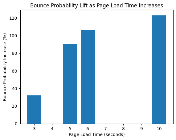
Here is the hard stat that frames the urgency. Over half of mobile visits are abandoned if a page takes more than 3 seconds to load. This is before your offer, price, or product even gets a chance.
In this blog article, we break down how high-converting e-commerce landing pages are actually built, using patterns you can observe across Amazon, Myntra, Flipkart, Nike, Adidas, Ajio, and other large stores that operate at an Indian scale.
A landing page is not a design project but a revenue system. You design it around intent, friction, and trust, then you run it like a product with a backlog.
What is the intent behind a high-converting e-commerce landing page?
Start with the intent of the e-commerce landing page because it decides everything that follows: hero copy, imagery, layout, modules, and even what you remove.
At FTA Global, we use a simple intent map for e-commerce landing pages:
- Buy now intent
The visitor already knows what they want. They need price clarity, a delivery promise, payment options, and a fast checkout path. - Compare intent
The visitor is choosing between options. They need filters, comparison cues, specs, social proof, and confidence signals. - Deal intent
The visitor is motivated by savings. They need clear discount math, scarcity, eligibility rules, and fast browsing. - Discovery intent
The visitor wants inspiration. They need curated collections, style guidance, and lightweight ways to shortlist.
This is why generic landing pages fail. They try to serve all intents with one page and end up serving none.
If your campaign is for running shoes, do not land people on a general footwear page. If your ad says an extra 20% off on prepaid, the landing page must confirm it immediately. This is a message match, and it is directly tied to ad efficiency.
E-commerce landing page framework for predictable conversion
Conversion is not a creative win. It is your page earning a series of small yes decisions, one after another.
Use this framework to build landing pages that convert consistently, especially in Indian ecommerce, where trust and convenience drive sales.
Step 1: Win the first 5 seconds
The shopper arrives with one question in mind: Should I stay or bounce?
Your first screen must answer this instantly:
- Is this relevant to what I came for?
- Is the value clear: price, offer, or benefit
- Can I trust this enough to proceed?
If any of these is unclear, they do not scroll. They leave.
Step 2: Remove the friction tax
Every extra tap, hidden condition, or surprise fee is a conversion leak.
Marketplaces like Amazon and Flipkart outperform here because they reduce uncertainty early:
- Delivery timelines by pincode
- Clear return and replacement terms
- COD, UPI, EMI visibility
- No surprises at checkout
Your goal is simple. Make buying feel effortless before the shopper commits.
Step 3: Build a trust stack
Trust is not a logo badge in the footer. It is a set of signals repeated exactly where doubt appears.
Your trust stack should show up near key decisions:
- Real review volume and quality
- Authenticity and warranty clarity
- Return and replacement confidence
- Payment security reassurance
- Clear accountability, who sells, who supports, who resolves
The page should feel designed to protect the buyer, not just to sell.
Step 4: Close with a clear next action
A CTA is not designed. It is the moment of decision. Make it value-driven but not click-baity or salesy. A good CTA always focuses on the buyer’s pain point or interest.
Make the next step obvious and low risk:
- The CTA is visible without hunting
- The page explains what happens after the click
- The buyer feels in control, not trapped
When your page nails these four steps, conversion stops being unpredictable and starts becoming a system you can scale.
How do you design the first screen to win the click?
The first screen, especially on mobile, decides whether the visitor scrolls or bounces.
What top e-commerce players do consistently:
1. Lead with a concrete value promise
Adidas category pages and sale pages keep the promise simple: category, discount, and policy highlights, such as shipping and returns.
2. Put the decision tools up front
Amazon and Flipkart style pages push the tools that shorten decision time:
- Search
- Price visibility
- Rating visibility
- Delivery or availability cues
- Payment options
3. Keep the CTA and price relationship tight
Nike product pages make the CTA feel low-risk by pairing it with clarity on delivery and returns close to the buying action.
Thumb rule: the first screen must include one primary promise, one proof cue, and one next step.
Above the fold, e-commerce copy and visuals that sell
E-commerce landing pages do not need more words. They need better words in the right places.
You can refer to this copy stack:
- Intent headline
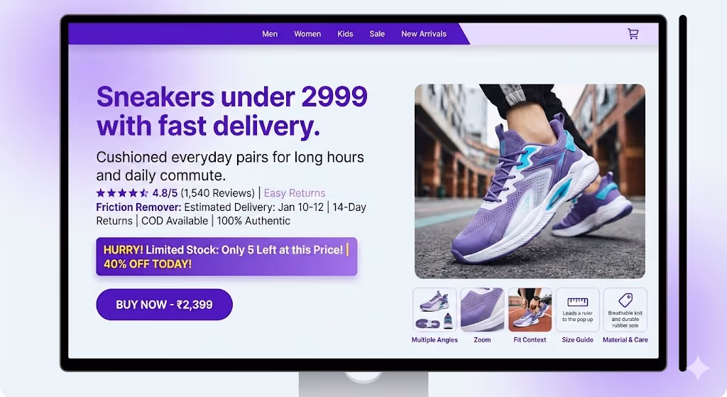
Match the query and the campaign. Example: Sneakers under 2999 with fast delivery. - Outcome line
Make the benefit obvious. Example: Cushioned everyday pairs for long hours and daily commute. - Proof line
Use numbers when possible. Ratings, review counts, or a simple claim like easy returns. - Friction remover
Delivery estimate, returns window, COD, prepaid offers, and authenticity.
On Myntra style pages, deal language often includes urgency cues such as limited stock and discount percentages. The goal here is decision speed.
Visuals should do one job: reduce any uncertainty for the buyer.
- Multiple angles
- Zoom
- Fit context for fashion
- Size guide access
- Material and care highlights
How do top Indian marketplaces reduce friction before checkout?
Indian e-commerce has unique friction points: COD dependence, delivery variability by pincode, and trust sensitivity around returns and authenticity.
Here is what the leading stores do well, and what you should replicate in your own way.
Delivery clarity as a conversion lever
Myntra and Ajio lean heavily on pincode-based delivery cues and shipping assurance language. Flipkart product pages also highlight replacement and authenticity cues.
What do we recommend: show the delivery promise before the visitor commits, not at checkout.
Returns clarity as risk reversal
Ajio and Flipkart explicitly highlight return or replacement options. Nike and Adidas reinforce free returns near the point of purchase, which is a confidence accelerator. Treat returns as a sales asset, not a policy page buried in the footer.
Payment flexibility to protect conversion
Flipkart and Amazon-style pages commonly surface EMI options and COD availability because they remove a major buying barrier in India.
Trust cues that feel earned
When marketplaces say 100 percent authentic or assured quality, they are addressing a real fear. This is why trust cues win.
Do not copy marketplace language. Prove trust with specifics: warranty, brand authorization, easy replacement, and transparent support.
Trust signals, delivery clarity, and returns messaging
Anchor: e-commerce landing page trust and friction scorecard
Below is a comparison of what large e-commerce stores consistently surface on high-intent pages and what that communicates to buyers:
.avif)
High-converting pages do not rely solely on persuasion. They reduce perceived risk through visible policies, and they reduce effort through clarity on delivery and payment. This is the conversion playbook across marketplaces and premium brands.
How do you make mobile landing pages fast enough to convert?
In India, most e-commerce traffic is mobile, and a big chunk of it comes from mid-range Android phones on inconsistent networks. So speed is not a tech KPI. It is the first trust signal.
A fast landing page does three things before anything else loads:
- Shows the product or offer clearly
- Confirms price and key conditions like delivery and returns
- Gives a visible next step, add to cart, shop now, or buy now
Everything that delays this, heavy scripts, oversized banners, late loading UI, silently taxes conversion. The brands that win treat speed like a revenue feature, not an engineering cleanup.
The table should show how high performing ecommerce brands reduce mobile friction through speed-focused choices.
Page speed and Core Web Vitals for e-commerce conversion
Here is the conversion-focused speed checklist we use in audits:
- Prioritize above-the-fold assets
Load hero image, price, and CTA first. - Kill layout shifts
Reserve image space, stabilize fonts, and avoid late-loading banners. - Reduce third-party overload
Every extra tag competes with your revenue. - Use image discipline
Right formats, responsive sizes, aggressive compression. - Measure on real devices in India
Fast wifi is not your customer's reality. Test on mid-range Android devices and typical mobile networks.
If you do only one thing this quarter, do this: ship a faster landing page variant for your highest spend campaign. It is the fastest way to unlock efficiency.
What should you test first to lift conversion without burning traffic?
Most experimentation fails because teams test cosmetic changes instead of decision blockers.
Start with tests that impact buyer certainty and effort:
Test set 1: Reduce surprise and uncertainty
- Put the delivery estimate near the CTA
- Put the return window and replacement promise near the CTA
- Clarify total cost early, including shipping thresholds
Test set 2: Improve decision speed
- Add review summary and count near the top
- Add size guide visibility for fashion
- Add comparison cues on listing pages
Test set 3: Increase perceived control
- COD and payment options visibility
- Trust badges that are specific, not generic
- Clear support and escalation cues
Test set 4: Tighten message match
- Align the headline to the keyword intent
- Align the hero visual to the ad creative
- Remove irrelevant navigation for campaign pages
A large-scale checkout study reports that a significant portion of users abandon due to a lack of trust and due to missing payment methods. You do not fix that with a new color palette. You fix it with clarity.
CRO experimentation, measurement, and governance for e-commerce teams
If you want landing pages to drive e-commerce growth, the operating model matters as much as the design.
Here is the governance structure that works for CMOs:
1. One landing page owner
Not a committee. One accountable owner with a weekly release rhythm.
2. A single scorecard
Track:
- Conversion rate by device
- Add to cart rate
- Checkout start rate
- Payment failure rate
- Returns the rate by landing page cohort
- Speed metrics on real users
3. A prioritization system
Rank experiments by:
- Revenue at risk
- Confidence in impact
- Complexity to ship
4. Behavior insight loop
Use session replays and heatmaps to see what analytics cannot. Where users rage click, where they drop, what they ignore.
5. Build for compounding
The goal is not one big redesign. The goal is 20 small lifts that compound over a quarter.
The best e-commerce teams treat landing pages like products. High-converting e-commerce landing pages are not built with surface-level design changes. They are engineered around intent, speed, trust, and clarity at every decision point.
The brands that grow consistently remove friction before shoppers feel it. When your landing pages do that well, traffic stops leaking and starts compounding into revenue.

Do you want more traffic?